The American Booksellers Association is among many national groups working with their legal counsel to alert its members of a growing legal risk related to their online retail websites and compliance with emerging requirements under the Americans with Disabilities Act (ADA). This document will help you take some first steps towards making your website more accessible.
Digital accessibility means that your website is designed in such a way that anyone can use it regardless of individual ability. When considering digital accessibility, you are not just taking people with disabilities into account, but also people without disabilities with other circumstances such as using the website on a mobile device, the age of the user, or a slow internet connection.
Not only will your website be in compliance with the requirements set by the ADA, but Search Engine Optimization (SEO) will prioritize websites that are ADA compliant. This means the more accessible your website is, the higher it will be displayed in search results.
Before beginning the process of accessibility, it’s important to understand accessibility is not a single goal to achieve, but rather a strive to constantly improve. Below are some use cases that can help you in this process.
Images
When adding images to your website there are a few important things to keep in mind. The image needs to have a text alternative, the image should have a label, and textual information should never be displayed in an image without alternative text.
Adding Alt Text
Alternative Text (Alt Text) is used when an image cannot be displayed. Instead, written text will either be displayed or read to the customer if the image cannot be seen. The IndieCommerce team already provides Alt Text for cover art on titles available through Ingram, but all other images on your website need to have a text alternative as well.
For New Images
-
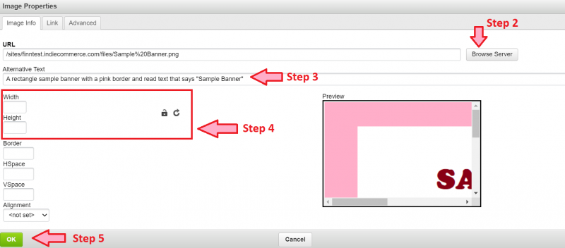
In the body of the Block or Page you’re adding the image to, click the ‘picture icon’ to upload the image from the file browser
-
Select your file
-
In ‘Alternative Text’ enter descriptive text for the image. This should describe the image in case the image cannot be displayed or seen.
-
Delete the dimensions that have populated into the field and click the lock icon to an “unlocked” position. This will ensure that the image is displayed correctly across devices.
-
Click ‘OK’


For Existing Images
-
Locate the page or block that is hosting the image and click ‘edit’
-
Double click the image in the body
-
In ‘Alternative Text’ enter descriptive text for the image. This should describe the image in case the image cannot be displayed or seen.
-
Delete the dimensions that have populated into the field and click the lock icon to an “unlocked” position. This will ensure that the image is displayed correctly across devices.
-
Click ‘OK’
Providing an Alternative for Images
There are several different ways to post information on your website, but textual information should never be displayed within an image without a text alternative. If the image distorts, or if the image doesn’t have alternative text, the information will be inaccessible to some users.
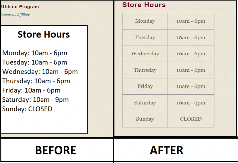
Below, the example store has posted their store hours inside of an image and placed this image within a Block. We are going to replace this image with a table of store hours instead.
-
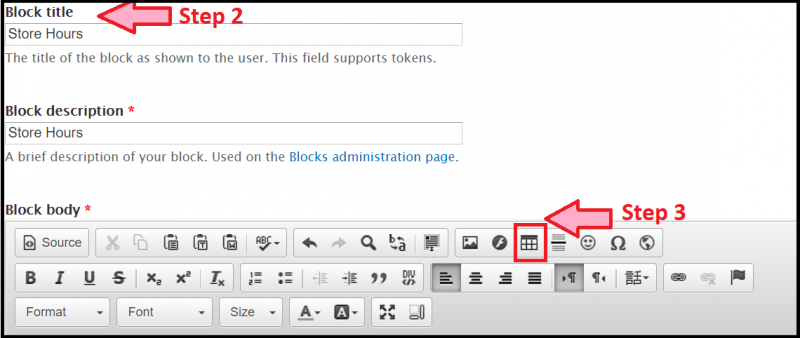
Navigate to Structure > Blocks
-
Locate the Block and click ‘edit’
-
Add a label to the table using the Block Title
-
Click the ‘table icon’ in the text editor
-
Set the number of columns and rows for the table. (For this example, we’re going to create a table with 7 rows and 2 columns)
-
Enter your store hours into the table
-
Click the pre-existing image to highlight it, then either cut or delete the image
-
Save


Embedded Videos
If you want to embed a video on your website, the video must have one of two things: either closed captioning or a text alternative. Before you embed a video on your website check to see if the video already has captions.
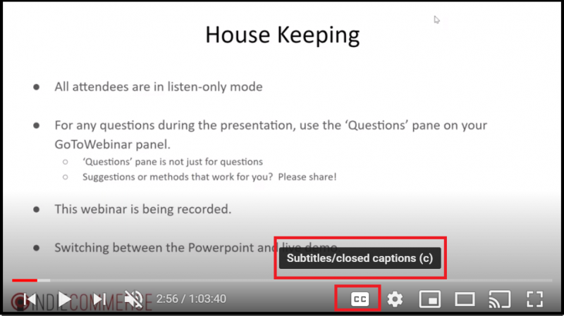
If the video displays a ‘CC’ button, like in the image below, that means the user who uploaded the video has already generated captions.

If this button is missing and you do not have access to edit the video, you will not be able to generate captions. Instead, you will need to provide a text alternative to comply with ADA guidelines. You could:
-
Add a transcript of the video below the embedded video
-
Give a text alternative to the video that contains the same information
-
Post a PDF copy of any slides or information in the video below the embedded video
-
Find a video with the same information that already includes closed captioning
Aside from text alternatives, it is also critical to be aware of flashing lights or bright colors. In general, you should not include any videos or animated pictures that flash 3 times or more in under 1 second as this is a very common trigger for seizures.
Pages
When building pages on your website it is important that they use ‘Semantic Markup’. This means that the page should be using the correct tools for the correct items (headers for headings, ordered lists for instructions, etc). This will make your page clear, understandable, and easily navigable as it gives the page more structure on a technical level.
When taking semantic markup into consideration, the three biggest things to consider are informative titles, correct section headers, and proper use of hyperlinks. To better illustrate these concepts, we have included 2 different versions of an example page and instructions on how to enact these changes.
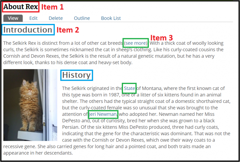
Page Before Accessibility Changes:

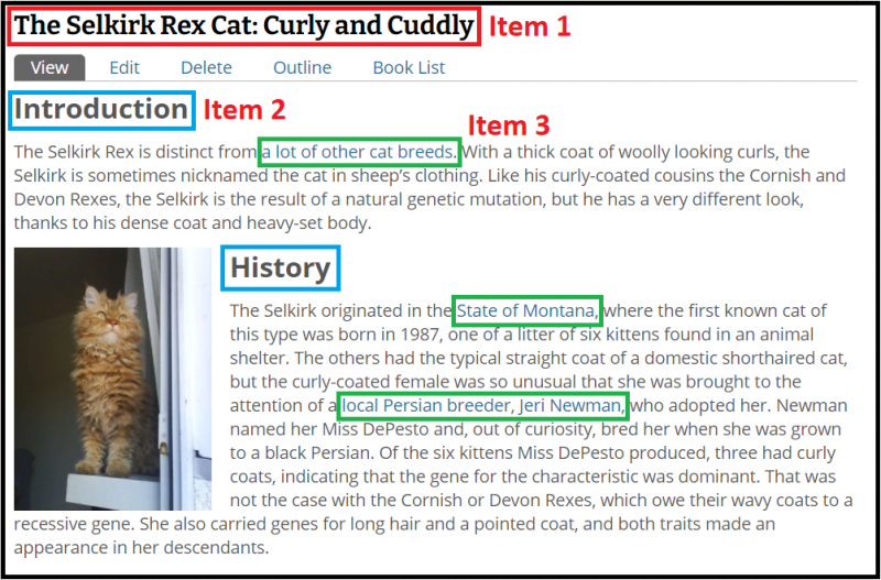
Page After Accessibility Changes:

Item 1 - Titles
In our original title, it is not clear what the purpose of this page is. Who is Rex? What are we going to be learning about Rex? This page does have a label, but it doesn’t give the user any information about what the page contains. Overall, it’s a vague title that doesn’t offer much information.
In our updated version, we have expanded the title and made it more informative. Now, just by reading the title, users are able to determine what the page is about, what information it will contain, and is overall more clear in its purpose.
Item 2 - Page Structure
In our original page, the different sections of the document are organized by text that has been increased in size and bolded. While this gives the appearance of headers, other systems like screen readers or search engines don’t recognize this as clear page structure. Instead, to the system, it looks like a page with text and no separation between sections.
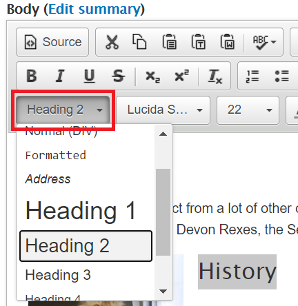
In our updated document, we have instead made these pieces of text official headers. We have done so by editing the document, highlighting the text, and changing the Format from ‘Normal’ to ‘Header 2’.

Item 3 - Hyperlinks
In our original document, there are a few issues with the way we’ve inserted hyperlinks. By placing ‘see more’ as a hyperlink a screen reader will read this text as a command and also click the hyperlink attached, even if the user wanted to stay on the same page. Also, hyperlinking text like ‘State’ and ‘Jeri Newman’ doesn’t give any context as to what these links lead to.
In our updated document, we have removed any hyperlinks that contain phrases such as “see more” or “click here”. We have also clarified what ‘State’ we were referring to and who Jeri Newman is, giving our users more context and understanding as to what these links lead to.
Testing Your Website’s Accessibility
There are several ways to test your website’s accessibility. These tools can highlight problem areas on your website and give further suggestions on how to improve your website’s accessibility.

